Lacréme
We enjoy eating
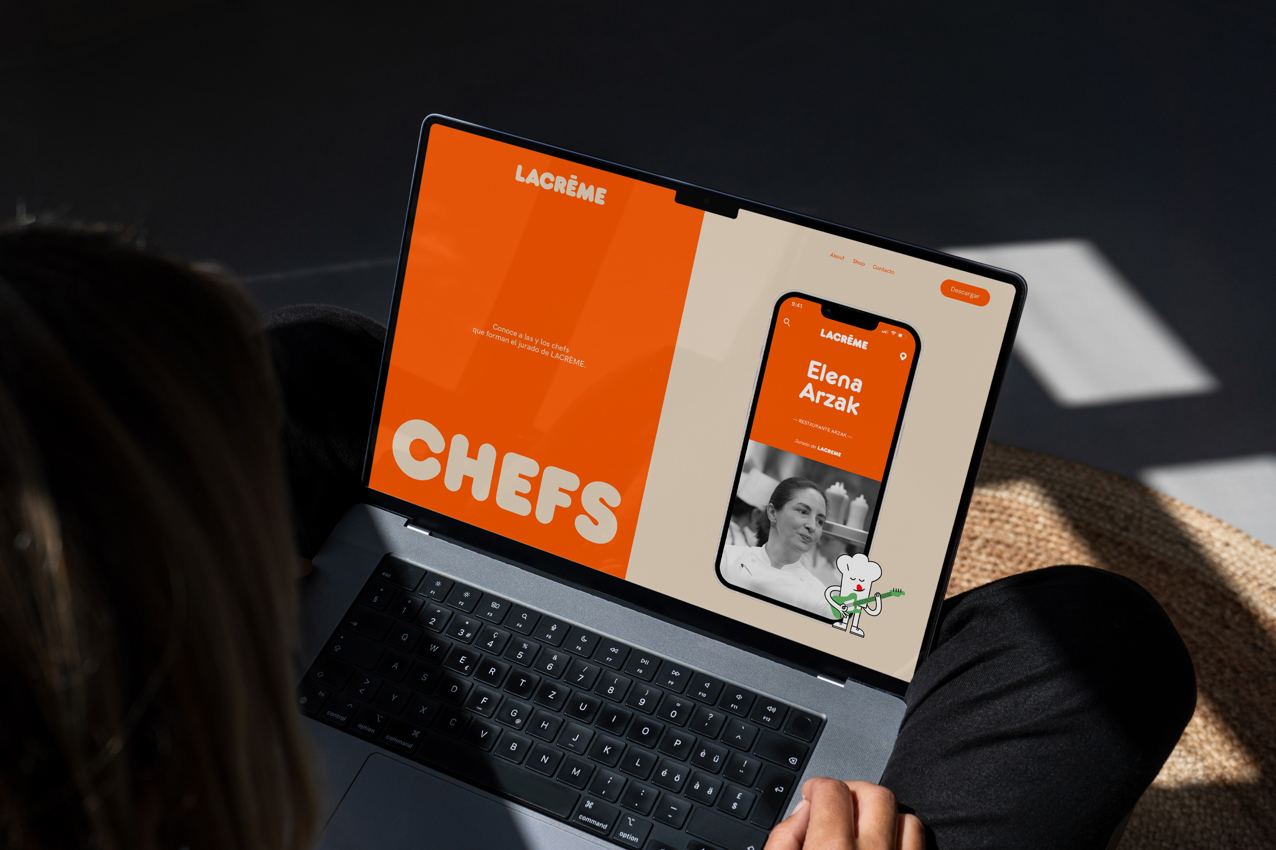
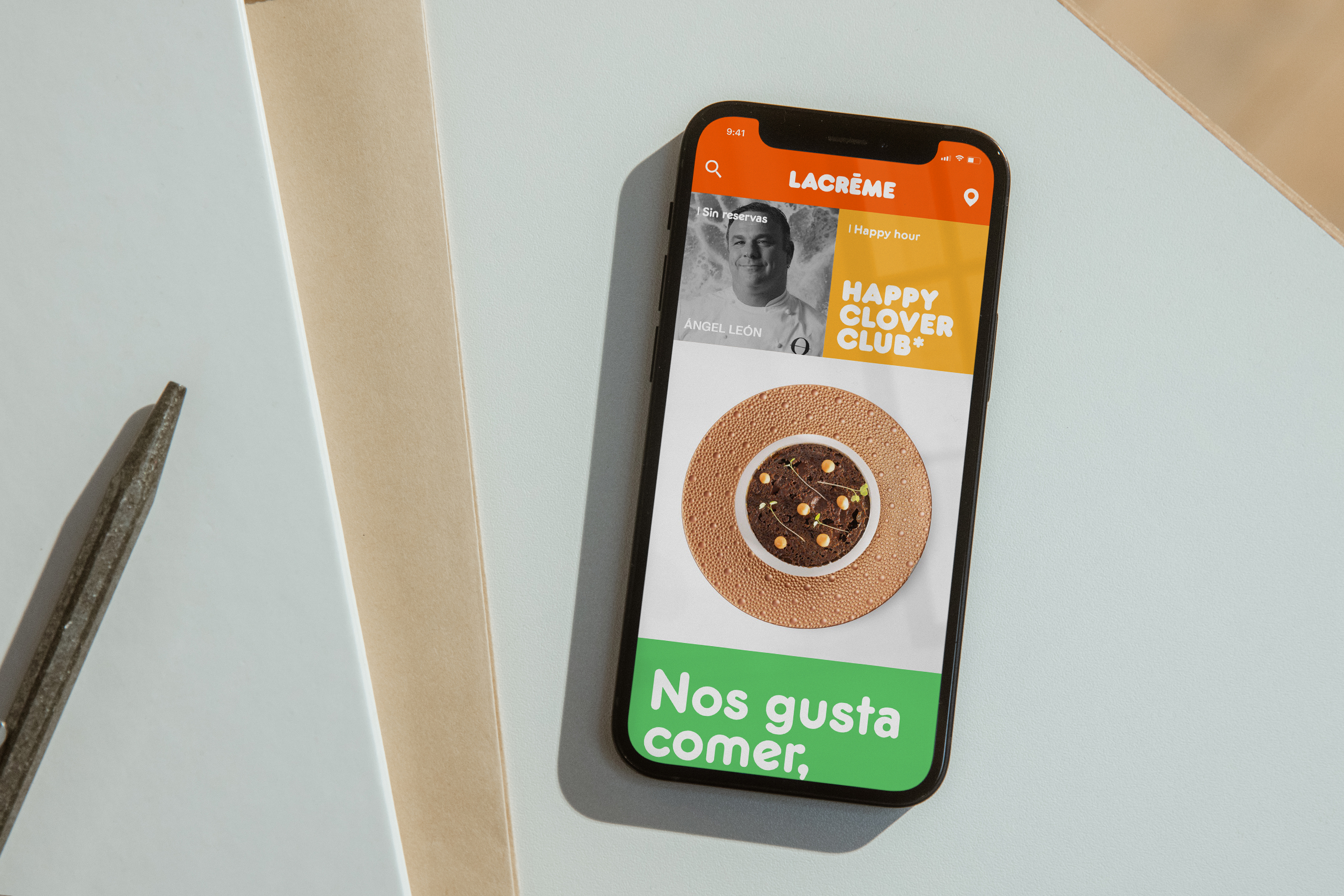
LACRÈME is a new app featuring a guide to Spain’s best dishes, handpicked by renowned chefs. The app provides info on dishes, restaurants, and chefs. With a vibrant and casual design, it aligns with the brand’s direct and digital communication style, leveraging platforms like Instagram and TikTok. LACRÈME connects chefs and food lovers, showcasing the finest in Spanish gastronomy.
Client:
Lacreme
Areas:
Digital design
Application design
The LACRÈME symbol is shown in different visual styles, adding variety to the brand’s look and content.
LACRÈME uses a friendly and fun font that’s both expressive and functional.
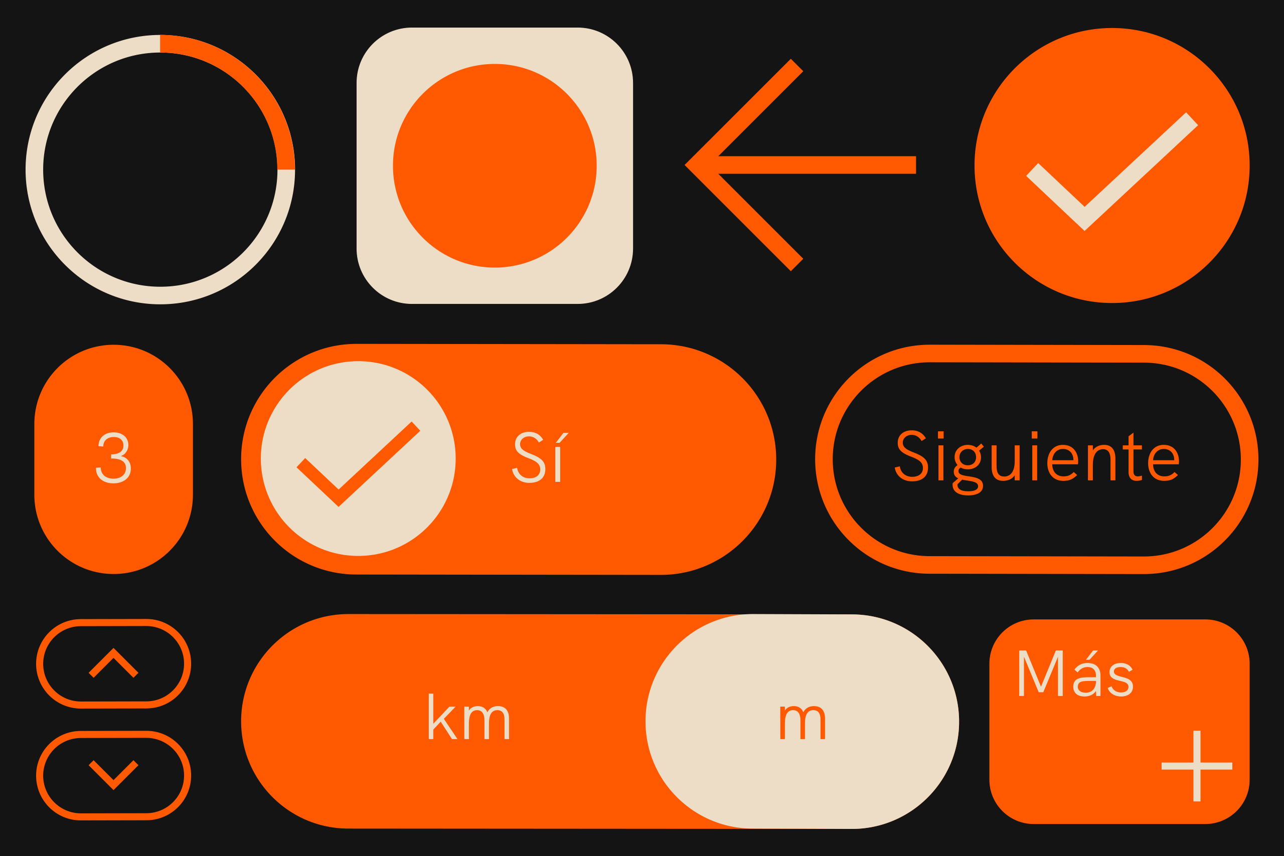
The components designed for the app share similar shapes and appearance with the main typography, creating a cohesive navigation experience aligned with the brand’s look and feel.
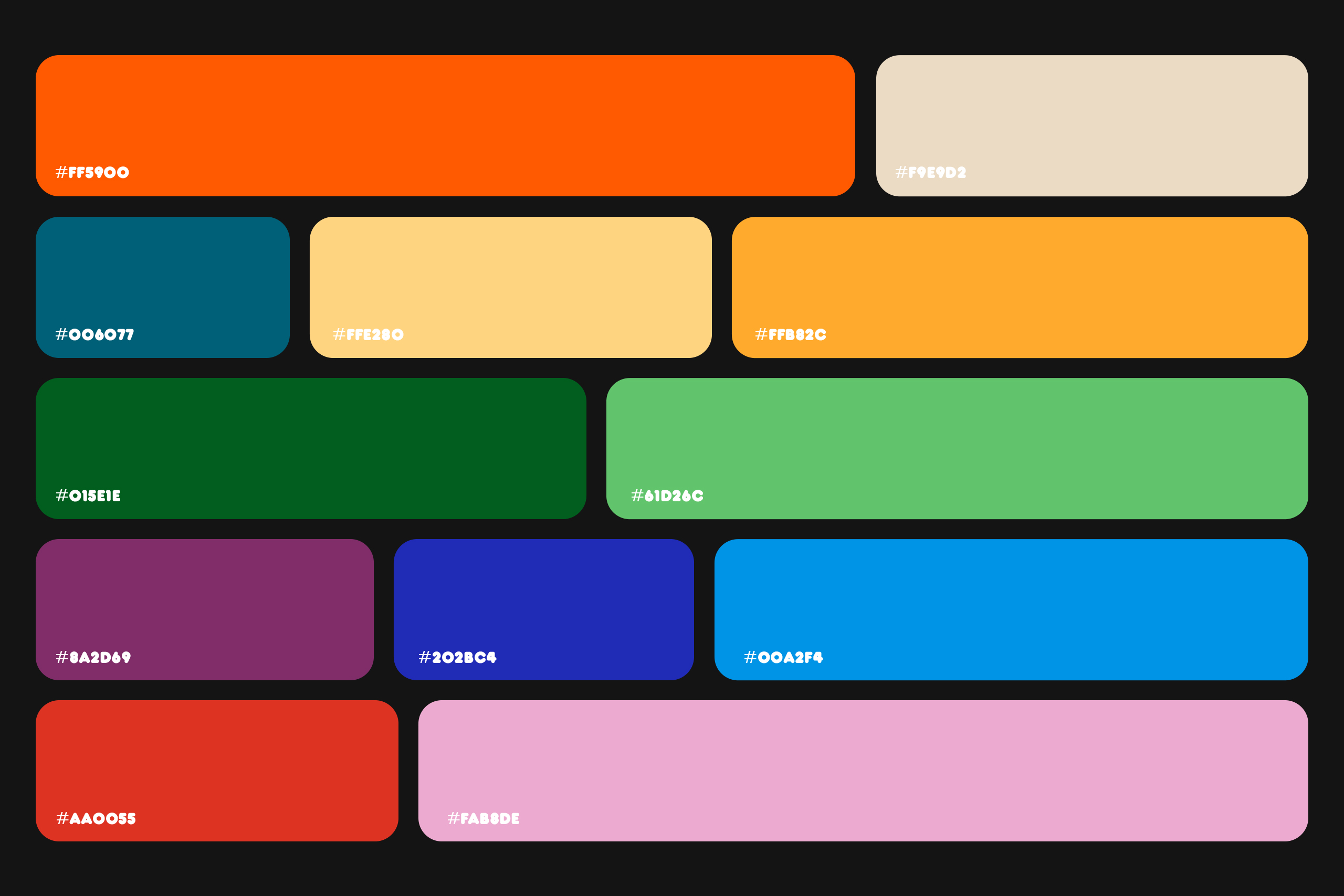
The colors are bold and vibrant, chosen for their brightness in digital environments.
Teamworking.
The app’s design was a collaboration with Kiku Aromir, who led the artistic direction of the project.

Modular design.
The content is organized in a block-based geometry that fits the information. Color and typography help structure the content, creating a diverse and user-friendly navigation.
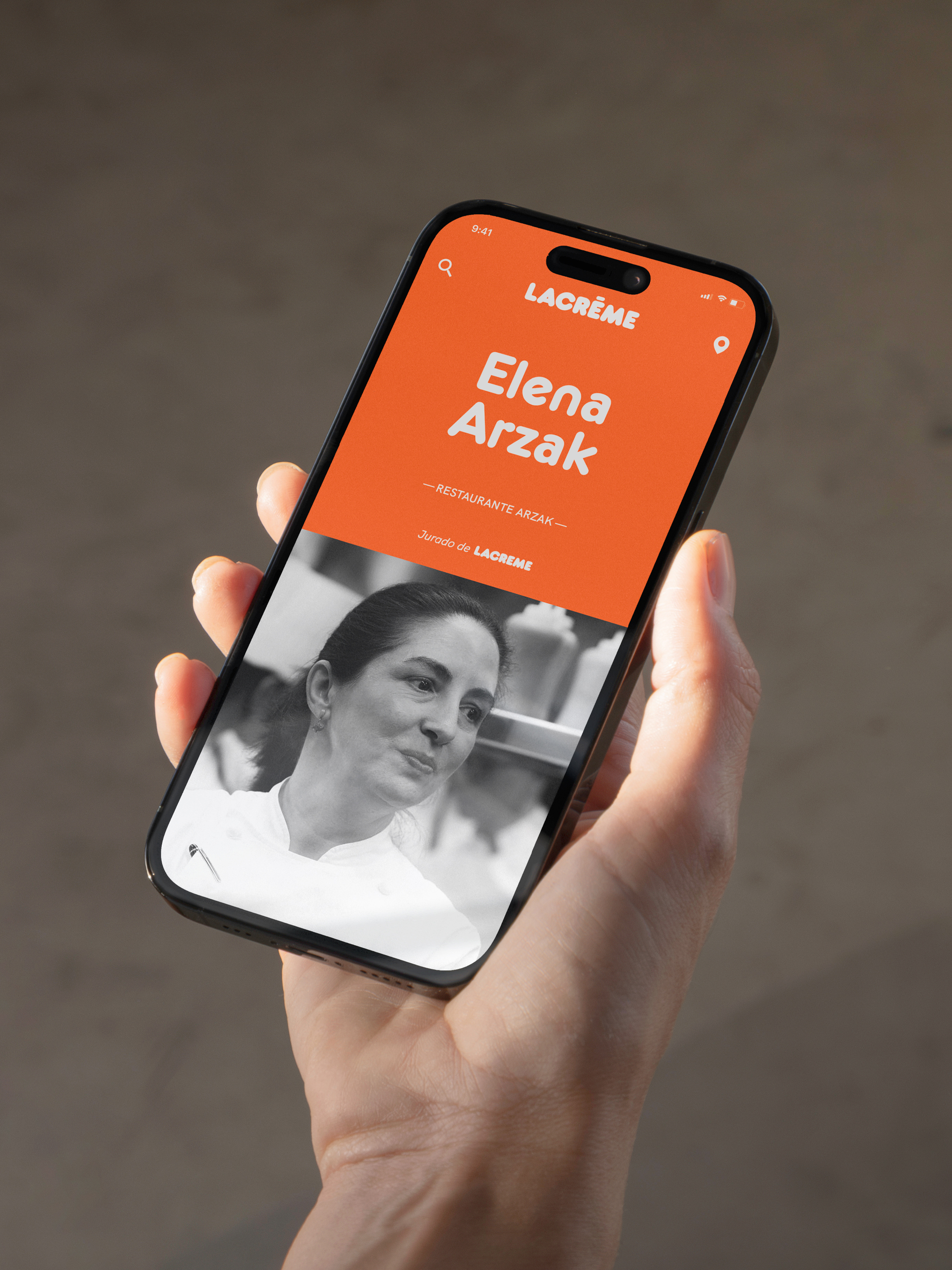
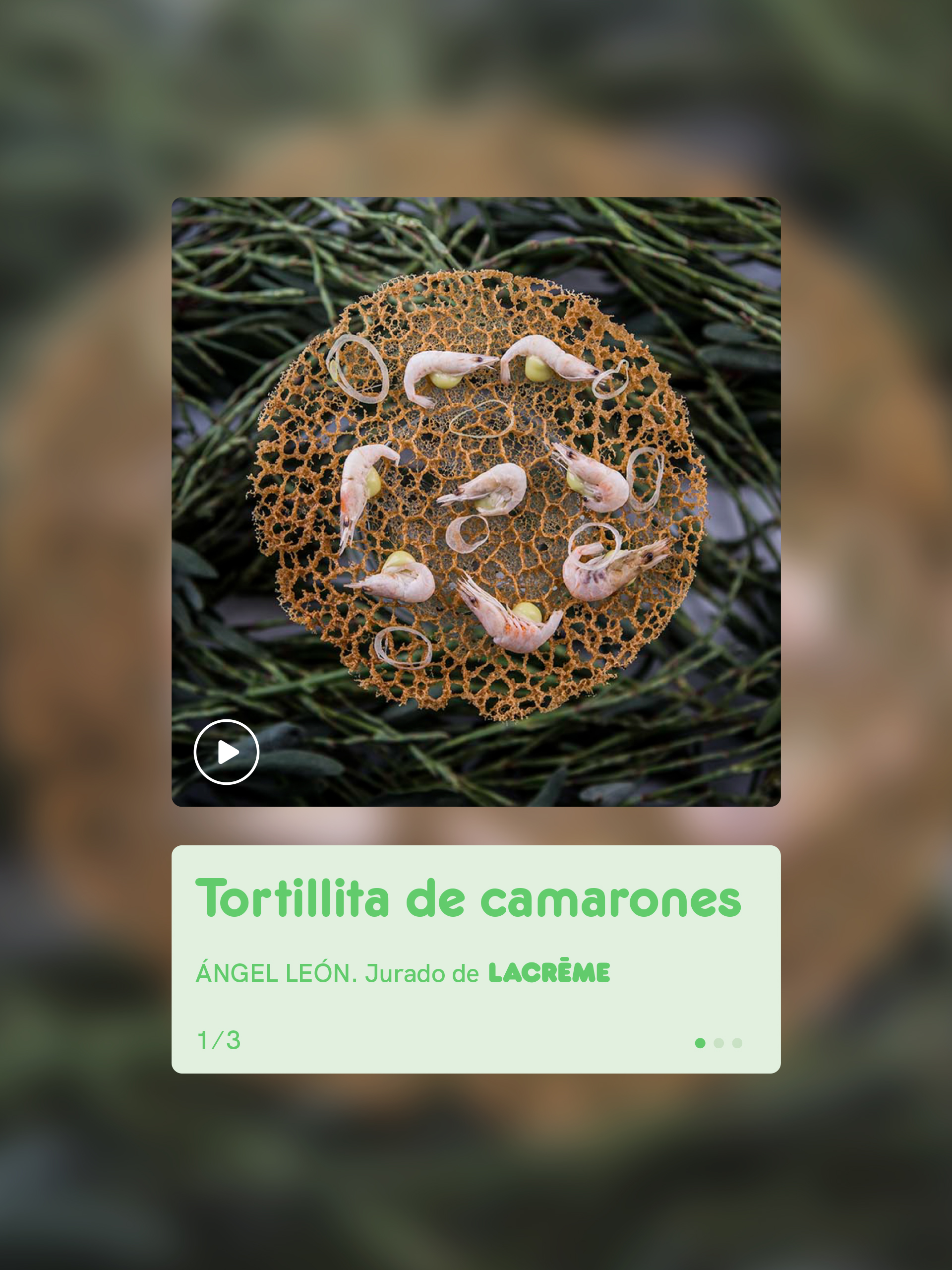
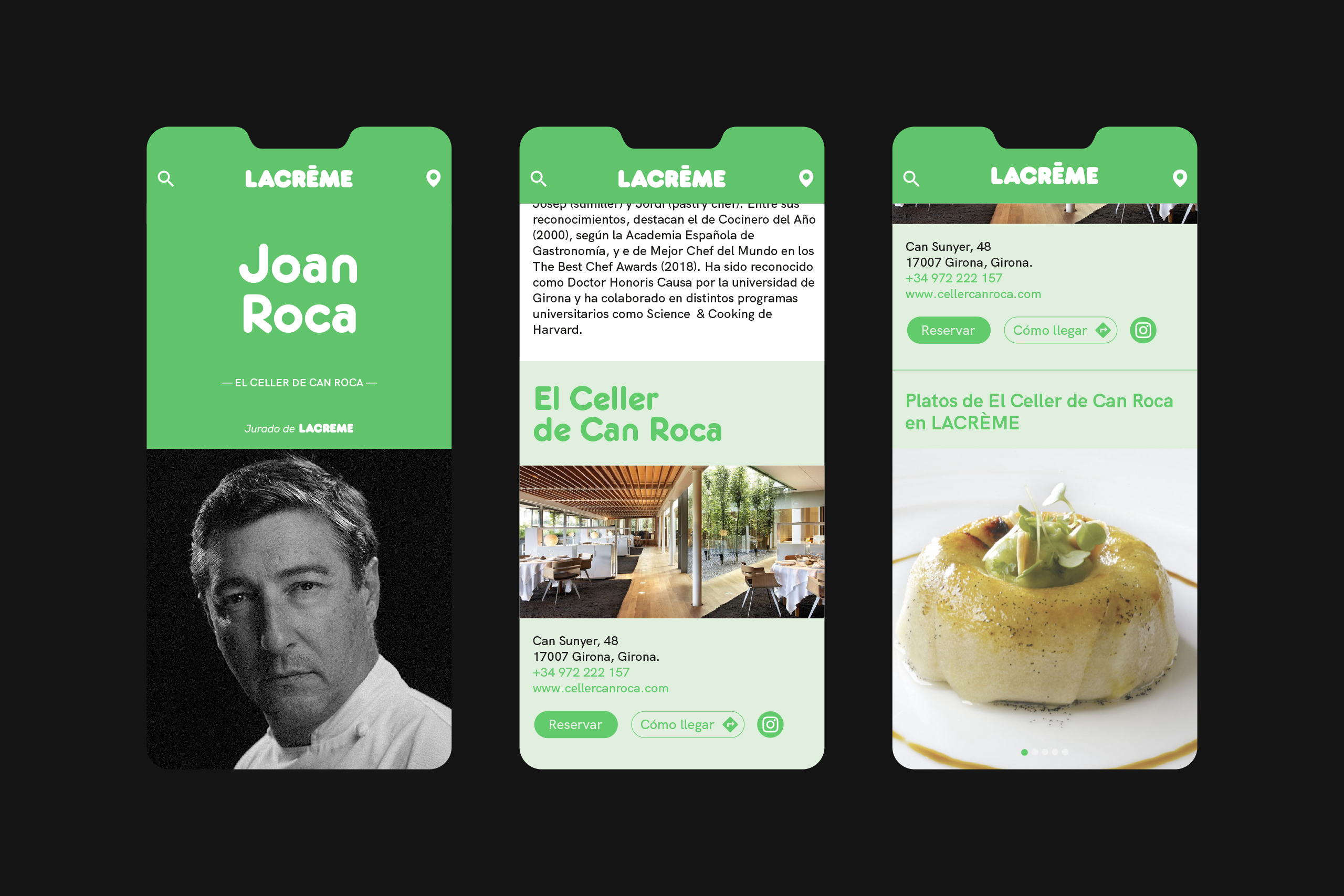
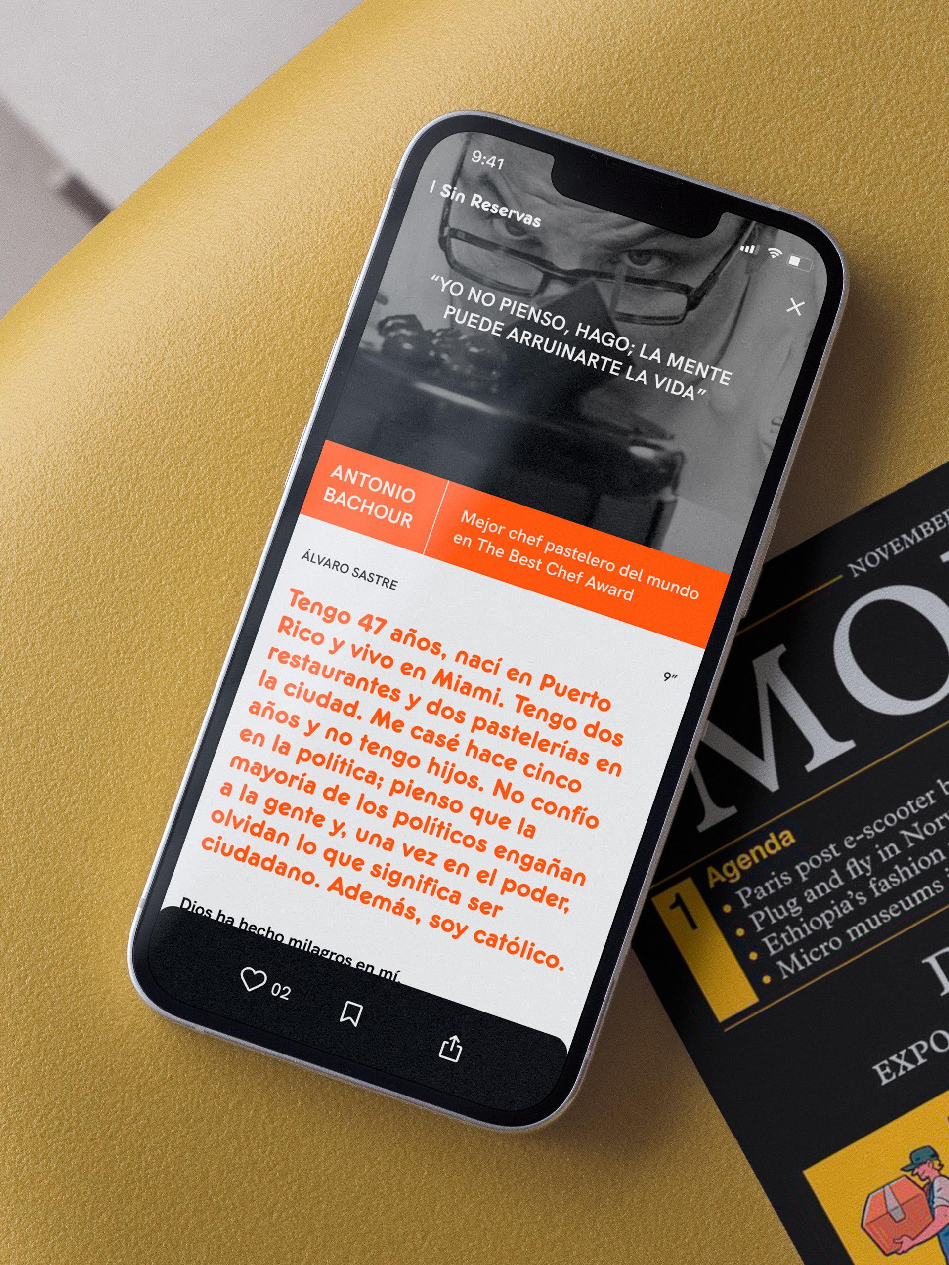
The block construction acts like a grid, giving the brand the flexibility to express itself using various resources and languages.
